Showing posts with label block. Show all posts

Wednesday, August 11, 2021

,
Midfield


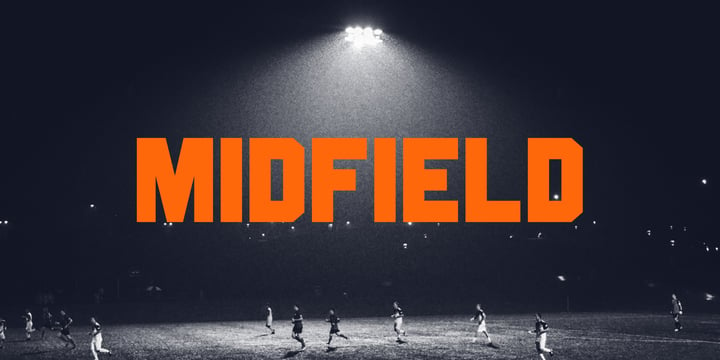
Introducing MIDFIELD DISPLAY. Midfield Family is All Caps display typeface with solid, masculine, urban, sporty, & bold character. Each glyph is very well suited to make an interesting quote, headline & striking poster design. This font is perfect for logos, badges, clothing, signage, posters, and much more!


This font includes standard and extended Latin characters as well as numbers and symbols. Multi-language support.

Midfield


Monday, August 9, 2021

,
Packaged Cookies JNL


An image found online of the first [1923] “Oreo Sandwich” package provided a type inspiration from the pen-lettered block sans with rounded corners used for the product's name. Prior to 1923, the cookies were sold in boxes or tins.  


The result is Packaged Cookies JNL, which is available in both regular and oblique versions.


Packaged Cookies JNL


Friday, December 25, 2020

,
Download SK One Block Fonts Family From Salih Kizilkaya


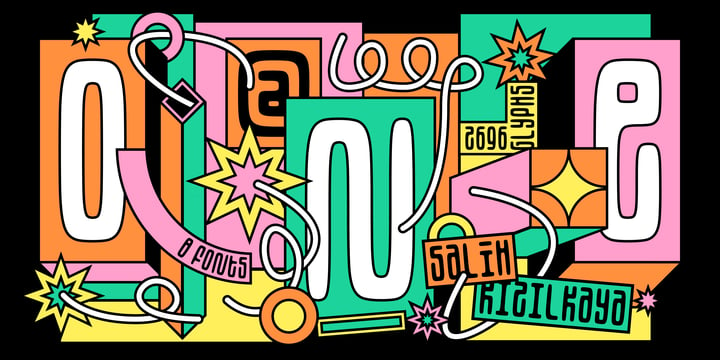
SK One Block was designed by Salih Kızılkaya in 2020. Inspired by Kufic typeface, this font includes many typographic material you will need. SK One consists of 8 different fonts and 2696 glyphs.


Download SK One Block Fonts Family From Salih Kizilkaya


Monday, October 5, 2020

,
Download Troptical Fonts Family From In-House International


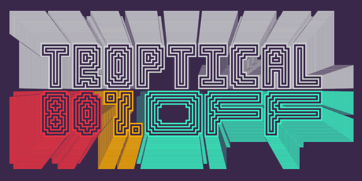
Troptical is a hypnotic, energetic multilinear typeface that’s all rhythm and movement. Featuring concentric lines and angular construction, Troptical is inspired by the dazzling dynamism of op-art and the clever geometry of Latin American design, with a dash of 8-bit video game playfulness.


Beneath its art-party, sporting-stripe vibes, this typeface is practical to the core. Troptical’s modular, building-block characters that were born to stack. And with five variable widths interchangeable across its three styles, it’s a typeface specifically developed for mixing and matching characters so every word is a design in itself. Troptical comes in three line weights across all styles and widths. C’mon, let’s dance. 


Font specs

Designed by In-House International and led by Alexander Wright, Troptical is available for Opentype format (.otf) compatible with Mac and PC. Each style family also includes a Variable option designers using compatible platforms. Check compatibility / support status for variable fonts at v-fonts.com/support/


Troptical is available in five standardized, interchangeable widths marked with ascending numbers that represent their span in columns: 10, 15, 20, 25, and 30. Each width is offered in three weights: Light, Medium and Bold. 


With a total of 45 unique fonts across such a wide range of weights and styles, this type family makes it easy to create optical, dynamic typographic treatments for when you just need your stills to move. It’s perfect for logos, large and graphic headers, publishing applications, presentations, packaging, apparel, merchandise and pedestrian-focused outdoor signage. 


Download Troptical Fonts Family From In-House International


Saturday, August 29, 2020

,
Download Juby Rounded Fonts Family From Fontsphere

Download Now
Server 1
Download Now
Server 2
Download Now
Server 3


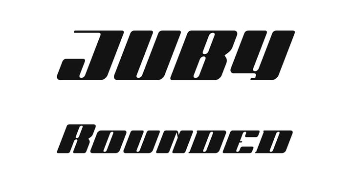
Juby Rounded - Heavy, visible and distinctive display font, rounded brother of the Juby Font.


Designed especially for display purposes. Can be used successfully in posters, headlines, visual identities, and everything needs to stand out.


Font containing uppercase and lowercase characters, numerals and a large range of punctuation.

The family has 3 weights with matching italics.


Download Juby Rounded Fonts Family From Fontsphere


Download Juby Rounded Fonts Family From Fontsphere


Thursday, August 20, 2020

,
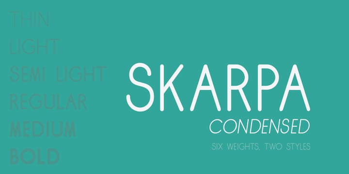
Download Skarpa Condensed Fonts Family From Aga Silva


This is condensed and more visually compact version of Skarpa font. All kerning has been thoroughly revised and manually adjusted.


The font is based on geometric forms devoid of excessive flourishing.

Would suit modern designs either in fashion, technology or laboratory setting. Would look good on door plaques in pharmacy or simple drawer plaques - especially Medium or Bold specimen. Lighter specimens would look good in leaflet & magazine print (see presented posters).


Download Skarpa Condensed Fonts Family From Aga Silva


Saturday, May 9, 2020

,
Download DeDisplay Fonts Family From Ingo


A type designed in a grid, like on display panels


Type is not only printed. There were always and still are a number of forms of type versions which function completely differently. Even very early in the history of script there were attempts to combine a few single elements into the diverse forms of individual characters and also efforts to construct the forms of letters within a geometric grid system. The “instructions” of Albrecht Dürer are probably most well-known.


But although designers of past centuries assumed the ideal to basically be an artist’s handwritten script, the idea which developed in the course of mechanization was to “build” characters in a building block system only by stringing together one basic element — the so-called grid type was discovered, represented most commonly today by »pixel types.« But even before computers, there were display systems which presented types with the help of a mechanical grid display, like the display panels in public transportation (bus, train) or at airports and train stations.


In a streetcar, I met up with a modern variation of this display which reveals the name of each tram stop as it is approached. This system was based on a customary coarse square grid, but the individual squares were also divided again diagonally in four triangles.


In this way it is possible to display slants and to simulate round forms more accurately as with only squares. The displayed characters still aren’t comparable to a decent typeface — on the contrary, the lower case letters are surprisingly ugly — but they form a much more legible type than that of ordinary [quadrate] grid types.


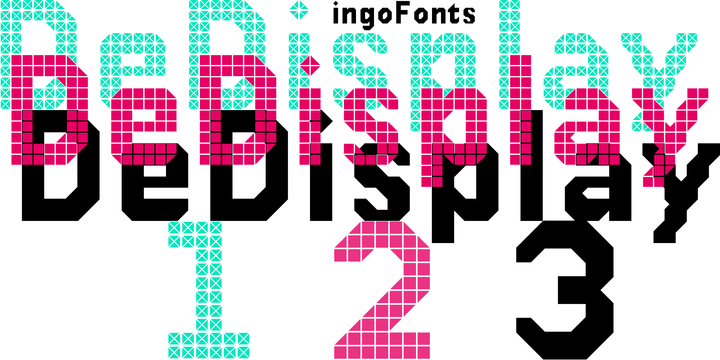
DeDisplay from ingoFonts is this kind of type, constructed from tiny triangles which are in turn grouped in small squares. The stem widths are formed by two squares; the height of upper case characters is 10, the x-height 7 squares.


DeDisplay is available in three versions: DeDisplay 1 is the complex original with spaces between the triangles, DeDisplay 2 forgoes dividing the triangles and thus appears somewhat darker or “bold,” and DeDisplay 3 is to some extent the “black” and doesn’t even include spaces between the individual squares.


Download DeDisplay Fonts Family From Ingo


Monday, March 2, 2020

,
Download Moilgo Fonts Family From Fype Co


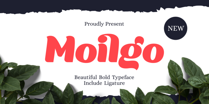
Moilgo is a beautiful bold typeface that was inspired by classic typefaces that are synonymous with luxury brands, beauty and elegant curves, high contrast and an all-round feel, perfect for art projects and typography across all platforms.


Moilgo also has unique ligatures which makes it easy for you to create a logo for your personal branding and your business beautifully. Moilgo will be perfect for many project like logos, magazines, posters, branding, packaging, quotes, blog headers, advertisements, and more.


Download Moilgo Fonts Family From Fype Co


Wednesday, February 19, 2020

,
Download Prymityv Fonts Family From Embe Studio
Download Prymityv Fonts Family From Embe Studio Download Prymityv Fonts Family From Embe StudioDownload Prymityv Fonts Family From Embe Studio


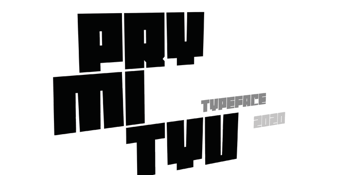
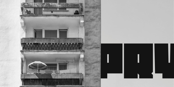
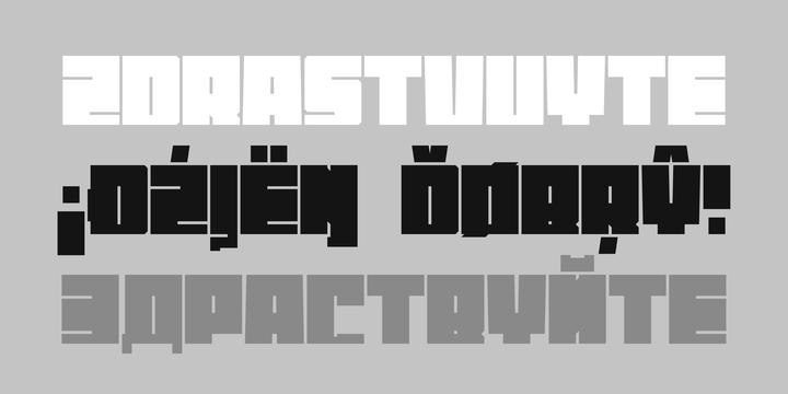
Prymityv is inspired by brutalist architecture from the Eastern Bloc. It's heavy and massive, perfect for display purposes. Prymityv contains Latin and Cyrillic alphabet, Latin with Western, Central and South Eastern European diacritics, Cyrillic with Russian, Bulgarian, Serbian and Macedonian and Ukrainian diacritics.


Download Prymityv Fonts Family From Embe StudioDownload NowView Gallery


Follow Us @soratemplates